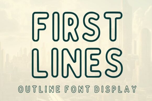
First Lines: A Modern Display Font for Digital Branding
As a UI designer who builds landing pages, SaaS dashboards, and boutique e-commerce experiences, I reach for display fonts not just for flair—but for function. First Lines stands out because it delivers both: bold rounded shapes and clean line strokes that read instantly on screen, yet carry enough personality to shape tone without sacrificing clarity.
This is a minimalist outline font—think crisp vector contours, even stroke weight, and generous negative space inside each glyph. It’s retro-modern in spirit (nodding to 70s signage and early digital interfaces), but engineered for today’s responsive layouts. The outline style avoids visual heaviness, making it far more versatile than solid-weight display fonts when layered over images or used at smaller sizes.
Where First Lines Earns Its Place in Your Design System
On websites and apps, First Lines excels where hierarchy needs emphasis without clutter. Use it for hero section headlines, product name displays, course title cards, or CTA buttons that must stop scrolling—especially against gradient or photographic backgrounds. Its open forms and consistent geometry ensure legibility even at 32px on mobile, and its rounded terminals soften contrast without sacrificing definition.
It’s not built for body copy—and shouldn’t be. But as a display font, it anchors attention precisely where you need it: the top of a pricing page, the header of a blog post series, the banner above a limited-time offer in an online store. I’ve used First Lines for coaching brand kits where “clarity” and “approachability” were core values—the font’s soft edges signal warmth, while its structural precision reinforces credibility.
Readability & Responsiveness: Real-World Considerations
On light backgrounds, pair First Lines with a high-contrast sans serif like Inter or Manrope for body text—this creates rhythm without competition. On dark mode or image overlays, increase letter-spacing by 2–4% and consider a subtle text shadow (1px blur, same color as background) to lift the outline from low-contrast surfaces.
For mobile-first layouts, avoid using First Lines below 28px in portrait view unless it’s a single-word headline. Its strength lies in impact—not density. In app navigation bars or small CTAs, test at 24px with generous padding: the rounded corners and uniform stroke hold up better than angular display fonts under tight constraints.
Strategic Pairings for Cohesive Digital Identity
A strong display font only works when supported by intentional pairing. With First Lines, I default to neutral, highly legible sans serifs for interface text—Inter, Poppins, or IBM Plex Sans—because their geometric openness echoes the font’s structure without mimicking it. For editorial or storytelling sites (like a creative agency blog or newsletter), a restrained serif like Lora or Cormorant Garamond adds contrast and gravitas in subheads or pull quotes—while letting First Lines retain sole ownership of the boldest moments.
Avoid pairing with other decorative fonts—especially scripts or handwritten styles. Their energy clashes with First Lines’s calm confidence. Likewise, steer clear of ultra-thin or condensed sans serifs; they create imbalance rather than harmony.
Practical Integration for Web Designers & Developers
First Lines ships as a webfont-ready package—including WOFF2 files optimized for fast loading, CSS variable support for seamless scaling, and full Latin character sets. It includes standard ligatures and basic multilingual support (covering Western and Central European languages), which matters for global SaaS brands or bilingual portfolio sites.
No alternate weights are included—this is intentionally a single-style display typeface. That’s a feature, not a limitation: it keeps your design system focused. If you need variation, use size, spacing, and color—not weight—to create contrast. And yes—it’s licensed for commercial use across websites, client projects, online stores, digital templates, and brand assets. Just verify the license covers your specific deployment (e.g., self-hosted vs. CDN, number of domains, or SaaS usage).
When to Reach for First Lines—And When to Pause
Reach for First Lines when you need:
- A hero headline that feels both contemporary and timeless
- Product naming that balances distinction with approachability
- Branded banners for email campaigns or social ads where recognition matters at thumbnail scale
- Logo lockups where the wordmark must scale cleanly from favicon to billboard
- Digital course or workshop titles that signal creativity without sacrificing professionalism
Pause if you’re designing for audiences requiring WCAG AA+ contrast compliance at all sizes—while First Lines performs well on most backgrounds, its outline nature means it requires careful testing against mid-tone or complex imagery. Also reconsider for long-form editorial headers where typographic texture might distract from content flow.
More Than Aesthetic—A Tool for Tone Consistency
In digital branding, consistency isn’t about repeating the same element—it’s about reinforcing the same feeling across touchpoints. First Lines supports that by offering a distinct yet adaptable voice: friendly but focused, modern but grounded, minimal but memorable.
Whether it’s the headline on your Notion template sales page, the featured title in your Figma community showcase, or the bold tagline atop your Shopify store’s homepage banner—First Lines delivers visual authority without shouting. It doesn’t try to do everything. It does one thing exceptionally well: give your digital presence a clear, confident first impression.