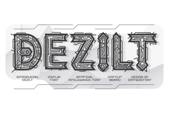
Dezilt: A Display Font That Cuts Through the Feed
It was 3 p.m. on a Tuesday—two days before launching a new online course series—and I was tweaking the final YouTube thumbnail set. The headline needed to feel urgent, intelligent, and unmistakably *next-gen*. I cycled through three clean sans serifs, then tried a bold serif… nothing landed quite right. Then I opened Dezilt. Instantly, the title “AI-Powered Design Thinking” snapped into focus—not just as text, but as a visual signal. Sharp angles, micro-gaps between strokes, subtle circuit-like interruptions in the letterforms—it didn’t just say “futuristic,” it *behaved* like it belonged in a high-res interface or a hardware startup’s launch video.
What Dezilt Actually Delivers (Beyond the Hype)
Dezilt is a display font—not a workhorse body typeface, but a precision tool for moments that need to stop scrolling. Its geometry is rigorously constructed: tight corners, consistent stroke widths, and fine-line detailing that evokes printed circuit boards and neural network diagrams without leaning into sci-fi clichés. It’s not cold or sterile; there’s rhythm in its asymmetry, and intention in every gap and junction. Think of it as the typographic equivalent of a well-designed dashboard—functional, layered, and quietly confident.
It thrives where you need contrast, clarity, and character in under five words: sale banners, course module labels, webinar titles, Instagram story stickers, or the “NEW” badge on a product page. In practice, it performed strongest when used at 48px and up on digital screens—and even better when layered over dark gradients or subtle tech-textured backgrounds. On mobile previews, it held its shape cleanly, especially with generous letter spacing (tracking +50–80) and no shadow overlays that muddy its fine lines.
Where It Shines (and Where It Steps Back)
In our recent Pinterest campaign for a design toolkit launch, Dezilt anchored all pin headlines—“Build Faster,” “Export Smarter,” “Design With Intent.” Paired with a neutral, airy sans serif (we used Inter Light for body), it gave each pin immediate visual authority without overwhelming the imagery. Same for Reels covers: short, high-contrast phrases like “No Code. No Problem.” popped off the screen without needing animation or extra effects.
But here’s what we learned the hard way: Dezilt isn’t built for dense context. We tested it in an email banner with a subhead and CTA button—all in Dezilt. It looked sharp, yes—but the subhead lost legibility fast on small screens, and the CTA felt visually heavy instead of inviting. So we adjusted: Dezilt only for the main headline (“Your Toolkit Just Got Smarter”), Inter SemiBold for the subhead, and Inter Regular for the button. That hierarchy worked because Dezilt wasn’t asked to do more than it’s designed for.
Avoid using it for: long paragraphs, legal disclaimers, pricing tables, or formal brand documents where neutrality and familiarity matter more than distinction. It also doesn’t replace a logo font unless your brand identity leans hard into speculative tech—think hardware startups, AI research labs, or immersive media studios—not B2B SaaS dashboards or academic institutions.
Smart Pairing Is Non-Negotiable
Dezilt needs breathing room and balance. Our go-to pairing? A highly legible, low-contrast sans serif—like Inter, Poppins, or Manrope—for everything *except* the hero moment. These fonts share enough modernity to feel cohesive but offer zero visual competition. For occasional accent use—like pull quotes in a course landing page—we added a restrained serif (Lora, slightly tightened tracking) to create tonal contrast without chaos.
We avoided script or handwritten fonts with Dezilt—they clash in energy and intent. Likewise, ultra-thin or ultra-bold companions often unbalanced its measured weight. Stick to fonts with similar x-heights and open counters. And always test pairings at actual usage sizes: what looks harmonious at 72px in Figma may feel disconnected at 16px in an email client.
Practical Checks Before You Drop It Into Campaigns
Before committing Dezilt to client assets or paid ads, we ran a quick pre-flight:
- Licensing: Confirmed commercial license covers social templates, digital ads, and downloadable branded assets (not just personal use).
- File formats: Verified .woff2 and .woff were included for web use, plus OTF/TTF for design apps and export workflows.
- Weights & alternates: Dezilt includes Bold and Black weights—no Light or Regular, which reinforced our decision to keep it strictly display-focused. We also checked for stylistic alternates (there are a few circuit-inspired glyphs) and basic multilingual support (Latin Extended-A covered our needs).
- Rendering: Tested across Chrome, Safari, and iOS Mail—no unexpected glyph swaps or rendering hiccups on live preview.
One note: if your campaign targets non-Latin markets (e.g., Arabic or Japanese audiences), verify extended language coverage separately—Dezilt’s current scope is optimized for English-first digital campaigns.
Real Use, Real Results—No Guesswork
For a limited-time shop promotion (“Q3 Tech Refresh”), we used Dezilt only for the campaign name badge across all touchpoints—Instagram posts, email headers, and website banners. Consistency wasn’t about repetition; it was about recognition. Followers began associating that precise, angular treatment with our most forward-looking offers—not because we told them to, but because the typography created a quiet, repeatable signature.
That’s Dezilt’s real strength: it doesn’t shout. It defines. It gives your campaign a distinct visual frequency—clean enough for professional contexts, detailed enough to reward attention, and disciplined enough to scale across formats without losing its voice. It won’t fix weak messaging or poor layout—but in the right hands, at the right moment, it makes your boldest idea look like it already belongs in the future.